Two Level Accordion Navigation
The menu can have up to six top level links and three directories - each with up to six links.
The directories show a chevron down icon and open accordion style on click or tap. In the open position, the icon changes to a chevron up.
The links within the directory have a cheron left icon.
The navigation width can be adjusted using a drag handle or the Metrics inspector and the widget height increased to show all the links if necessary.
The navigation can be visible on page load or toggle open/shut using a tab or tab in a responsive header. It can also be fixed in position in relation to the left or right and the top of the browser or device window
Visible Navigation
In this example, the navigation is visible on page load. When used with fixed width page layouts it can be placed anywhere.
Since the height of the navigation expands when a directory is open, it is important to select the widget and set it to "Always On Top" using the Arrange menu or the Metrics inspector so that it appears on top of any content placed below it.
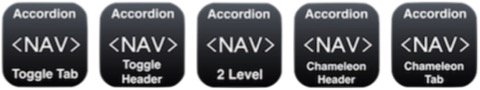
The same navigation menu can be set up to be toggled open and shut using the appropriate header or tab widget which incorporates the "hamburger" icon to make it active.
When used in toggle mode, the "Toggle Menu" checkbox in the widget settings is used to hide the menu prior to publishing.
Fixed Position
The navigation can also be fixed in position in relation to the top and left or right of the browser or device window.
To do this, select the widget, open the Metrics inspector and check the box to "Allow free dragging".
Drag the widget to the LEFT out of the content area and into the browser background and set the position left or right and the distance from the top of the browser or device window.
NOTE: Do not drag the widget over to the right of the design canvas as it will disrupt the layout when the page is viewed on a touch device like an iPad or iPhone.
- Icons
- E-Commerce
- Navigation
- Lazy Load
- Hero 4
- Sticky Tabs
- Flyout Navigation
- Navigation Widgets